Relational Analysis
The following section continues to visualise our bank customer data through comparing those who churned vs didnt.
To better understand what features predict a higher likelihood of customer attrition. Correlation and distribution were further examined using the following python and more.
	# Stacked bar plot for Number of Products vs. Churn
	products_churn_cross = pd.crosstab(index=df['products_number'], columns=df['churn'])
	products_churn_cross.plot(kind='bar', stacked=True, color=['lightblue', 'salmon'])
	plt.title('Churn by Number of Products')
	plt.xlabel('Number of Products')
	plt.ylabel('Count')
	plt.show()


	# Cross-tabulation
	gender_churn_cross = pd.crosstab(df['gender'], df['churn'])
	plt.figure(figsize=(8, 6))
	gender_churn_cross.plot(kind='bar', stacked=True, color=['lightblue', 'salmon'])
	plt.title('Churn by Gender')
	plt.xlabel('Gender')
	plt.ylabel('Count')
	plt.show()

	# Stacked bar plot for Gender and Credit Card vs. Churn
	gender_credit_churn_cross = pd.crosstab(index=[df['gender'], df['credit_card']], columns=df['churn'])
	gender_credit_churn_cross.plot(kind='bar', stacked=True, color=['lightblue', 'salmon'])
	plt.title('Churn by Gender and Credit Card')
	plt.xlabel('Gender, Credit Card', rotation=0)  # Rotate x-axis labels to be horizontal
	plt.ylabel('Count')
	plt.show()

	# Heatmap for selected numerical variable correlations
	plt.figure(figsize=(10, 8))
	selected_numerical_cols = ['age', 'balance', 'products_number', 'estimated_salary']
	selected_corr_matrix = df[selected_numerical_cols].corr()
	sns.heatmap(selected_corr_matrix, annot=True, cmap='coolwarm')
	plt.title('Correlation Matrix for Selected Numerical Variables')
	plt.show()
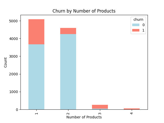
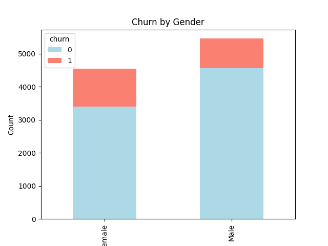
The following bar graphs show an increased likelihood of attrition among customers who use more than 2 products and females.


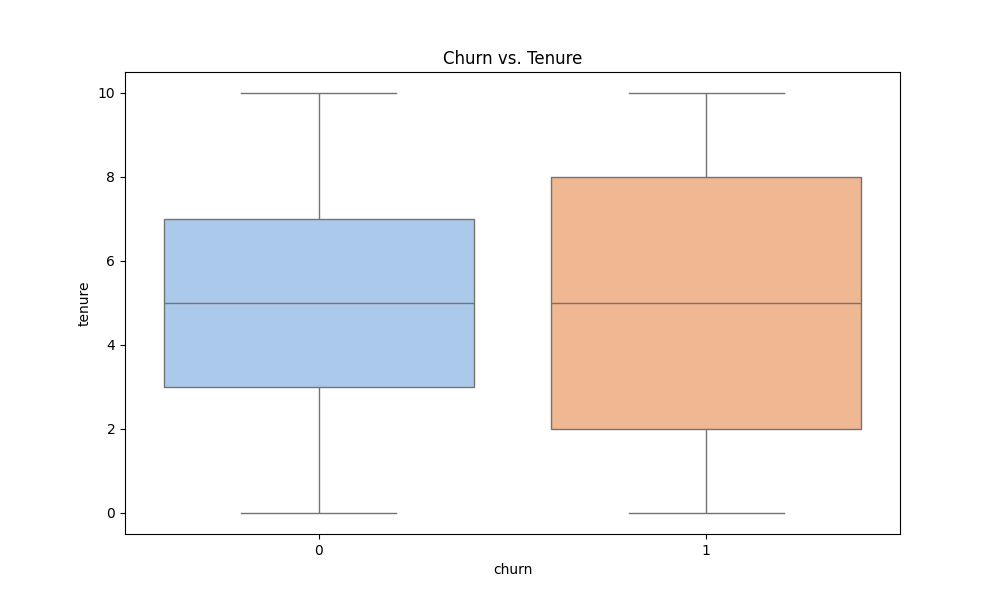
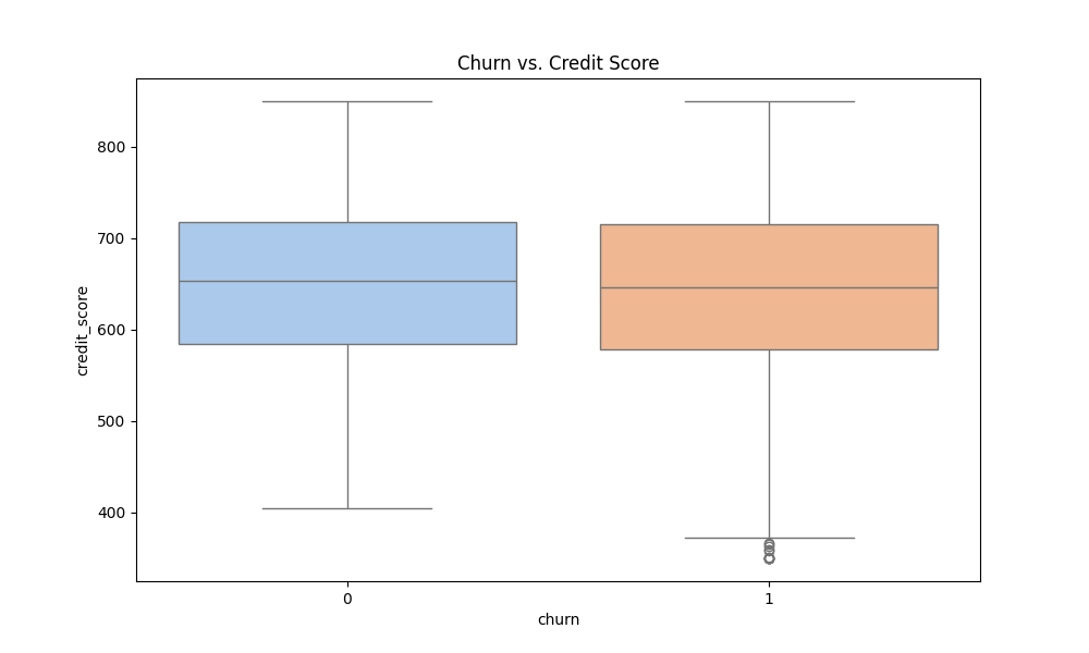
Looking more closely at distribution of tenure and credit score, its plausible that the newest customers and oldest customers have an increased likelihood of attrition, seen through a much larger interquartile range. No significant differences between customers who have churned and haven't were seen when investigating credit scores.


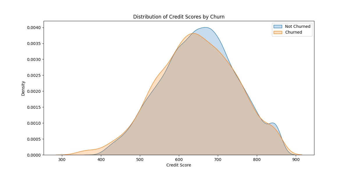
While comparing churn versus no churn in these variables can reveal crucial distinctions, the effectiveness of this analysis is enhanced by incorporating additional demographic variables. Let's revisit credit scores and tenure. Below is the code used for more comprehensive visualizations.
	# Distribution of Credit Scores for Churned and Not Churned customers
	plt.figure(figsize=(12, 6))
	sns.kdeplot(df[df['churn'] == 0]['credit_score'], label='Not Churned', shade=True)
	sns.kdeplot(df[df['churn'] == 1]['credit_score'], label='Churned', shade=True)
	plt.xlabel('Credit Score')
	plt.ylabel('Density')
	plt.title('Distribution of Credit Scores by Churn')
	plt.legend()
	plt.show()

	# Scatter plot of Tenure vs. Age with Hue by Churn
	plt.figure(figsize=(12, 8))
	sns.scatterplot(x='tenure', y='age', hue='churn', data=df, palette='coolwarm', alpha=0.7)
	plt.title('Scatter Plot of Tenure vs. Age with Hue by Churn')
	plt.xlabel('Tenure')
	plt.ylabel('Age')
	plt.show()

Looking at distribution in this way shows a subtle but potentially significant difference in credit scores of those who are churned, indicating a lower credit score is more associated with customers leaving the bank. .

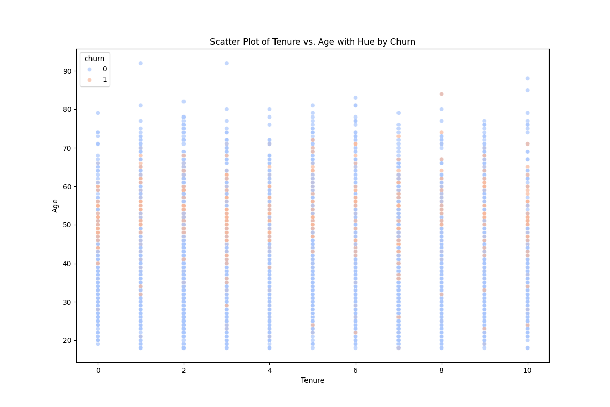
When pairing tenure with age, we can now see that those between the age of 40 and 65 are more likely to churn. This association persist through years of tenure with the bank.
analysis of any longitudinal populations.
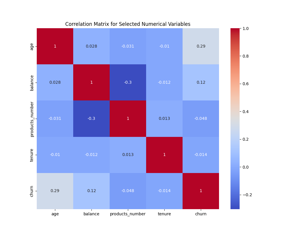
A quick way of objectively checking some of these associations is through a correllation matrix.
# Heatmap for selected numerical variable correlations
plt.figure(figsize=(10, 8))
selected_numerical_cols = ['age', 'balance', 'products_number', 'estimated_salary']
selected_corr_matrix = df[selected_numerical_cols].corr()
sns.heatmap(selected_corr_matrix, annot=True, cmap='coolwarm')
plt.title('Correlation Matrix for Selected Numerical Variables')
plt.show()

Of the selected variables, we can see that the previous trend of age increase being associated with churn is replicated in the correlation matrix.

