Home

Data Preprocessing and Extraction


A systematic approach of preprocessing and exploratory analysis of the dataset using Python and SQL integration via psycopg2 for PostgreSQL was the first step to creating useful visualisations and further analysis.

							
	# Import the dataset to a dataframe
	filename= 'data/dataset.csv'
	df = pd.read_csv('data/dataset.csv')
	pd.set_option("display.max_columns", None)
	pd.set_option("display.max_rows", None)
		
	# Check the amount of columns and rows
	print(df.shape)
	# >> (1552210, 44)
			

	# Check the headers of columns
	print(df.columns)

	"""Index(['Unnamed: 0', 'Hour', 'HR', 'O2Sat', 'Temp', 'SBP', 'MAP', 'DBP',
	'Resp', 'EtCO2', 'BaseExcess', 'HCO3', 'FiO2', 'pH', 'PaCO2', 'SaO2',
	'AST', 'BUN', 'Alkalinephos', 'Calcium', 'Chloride', 'Creatinine',
	'Bilirubin_direct', 'Glucose', 'Lactate', 'Magnesium', 'Phosphate',
	'Potassium', 'Bilirubin_total', 'TroponinI', 'Hct', 'Hgb', 'PTT', 'WBC',
	'Fibrinogen', 'Platelets', 'Age', 'Gender', 'Unit1', 'Unit2',
	'HospAdmTime', 'ICULOS', 'SepsisLabel', 'Patient_ID'],
		dtype='object')"""
		
	# Cursory glance at snippet of table
	print(df.head(15))


A significant size dataset with many null values in the first few rows printed. To get a clearer picture of how many values were missing and begin cleaning the dataset, I opted to import the table into a PostgreSQL and query from within Python using the library psycopg2.

Below is a function created to both query the Postgres database containing the table and export its query results into csv format if no existing csv of the same name is in the directory.


def export_query_to_csv(query, csv_file_path):

# Checks to see if file already present before committing function
if not os.path.exists(csv_file_path):
	conn = psycopg2.connect(database="sepsis", user='postgres', 
							password='*******', host='localhost',
							port='5432')
	cur = conn.cursor()
	# Generate the COPY command with the query
	outputquery = "COPY ({0}) TO STDOUT WITH CSV HEADER".format(query)

	with open(csv_file_path, 'w', newline='') as csv_file:
		cur.copy_expert(outputquery, csv_file)

	cur.close()
	conn.close()

	print("file saved successfully.")
else:
	print("file already found.")


With our new function made, it is easier to perform the necessary queries and save the transformed results. The first query was created to produce percentages of each columns missing values. Below is a snippet of part of the query.


query = """SELECT
ROUND(
	(SUM(CASE WHEN Hour IS NULL THEN 1 ELSE 0 END) * 100.0 / COUNT(*)::float)::numeric, 2
) AS Hour_missing_percentage,
ROUND(
	(SUM(CASE WHEN HR IS NULL THEN 1 ELSE 0 END) * 100.0 / COUNT(*)::float)::numeric, 2
) AS HR_missing_percentage,

......
	
FROM public.patient_data"""
				
csv_file_path = 'null_values.csv'
				
export_query_to_csv(query, csv_file_path)


To visualise query results, functions were created utilising Matplotlib and Seaborn. When called, this function would output a simple bar graph.

								
	def query_visualization_bar(filename, xl, yl, title, columns_to_clean=None):

	# Dictionary storing values from clean_column
	data = {}

	# opens csv and iterates through each row
	with open(filename, 'r') as csv_file:

		# using dictionary key-pairs to make data cleaning more streamlined
		csv_reader = csv.DictReader(csv_file)
		for row in csv_reader:
			for column, value in row.items():
				if column != "":
					clean_column = column
					if columns_to_clean:
						for text_to_remove in columns_to_clean:

							# Removing text in column header, specified when calling function.
							clean_column = clean_column.replace(text_to_remove, '')

					# Check if the value is an int
					if value.isdigit():
						data[clean_column] = int(value)
					else:
						# Try converting to float, use as-is if conversion fails
						try:
							data[clean_column] = float(value)
						except ValueError:
							data[clean_column] = value

	# Extracts keys, values from cleaned dictionary
	headers = list(data.keys())
	values = list(data.values())


	# Matplotlib bar plot
	plt.figure(figsize=(12, 6))
	plt.bar(headers, values, color='blue')
	plt.xlabel(xl) # variable for x-axis label
	plt.ylabel(yl) # variable for y-axis label
	plt.title(title) # variable for title
	plt.xticks(rotation=45, ha='right')
	plt.tight_layout()
	plt.show()	


Here are the results from the previous query inputted into our bar graph function.
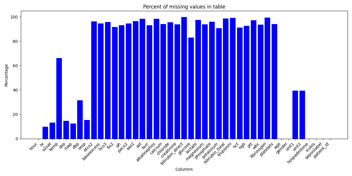
Percentage of Missing Values in Dataset You can see that there are MANY missing values in our dataset, particularly those that are laboratory tested. This makes sense because each row is a recording of a patients various health parameters at hourly intervals. Our more densely populated data relates to vital signs like heartrate (HR) and temperature (temp) as these are generally measured hourly for in-patients.

While tempting, it's important that we don't rush in and drop all of the columns with many missing values. Instead, appreciating the significance of these laboratory test and cleaning the data only as necessary appeared the best approach.


Exploratory Analysis

The following section continues the use of querying our Postgres database and visualising the output to derive preliminary insights.


To begin our exploration of the dataset, some simple questions like "How many people have sepsis vs without?" and "What is the distribution of gender in these groups?" were investigated.

						
# Query to extract the total count of Sepsis vs no Sepsis patients

query = """WITH MaxSepsisPerPatient AS (
	SELECT
		Patient_ID,
		MAX(SepsisLabel) AS MaxSepsis
	FROM public.patient_data
	GROUP BY Patient_ID
)


SELECT
	SUM(CASE WHEN MaxSepsis = 1 THEN 1 ELSE 0 END) AS total_sepsis_patients,
	SUM(CASE WHEN MaxSepsis = 0 THEN 1 ELSE 0 END) AS total_non_sepsis_patients
FROM MaxSepsisPerPatient"""

csv_file_path = 'sepsis_count.csv'

export_query_to_csv(query, csv_file_path)


# Visualisation: count of patients with sepsis and without in dataset

filename = 'sepsis_count.csv'
xl = 'Column'
yl = 'Total patients'
title = 'Total patients grouped by sepsis status'
columns_to_clean = ['_']
query_visualization_bar(filename, xl, yl, title)


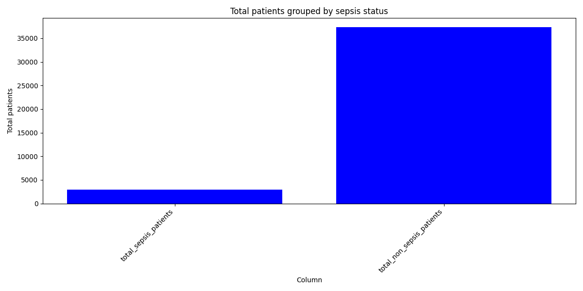
Count of total sepsis, vs non-sepsis patients

Our dataset is massively skewed towards patients without sepsis, infact patients with sepsis only make up ~8% of our dataset. Further queries will help to break down this distribution even more and determine the make up of gender and different types of sepsis presentations.


Query to find Split of gender and Sepsis

						
query = ("""WITH maxsepsisperpatient AS (
	SELECT
		patient_ID, gender,
		MAX(SepsisLabel) AS maxSepsis
	FROM public.patient_data
	GROUP BY patient_ID, gender
)

SELECT
	SUM(CASE WHEN maxsepsis = 1 and gender = 0 THEN 1 ELSE 0 END) as female_sepsis,
	SUM(CASE WHEN maxsepsis = 1 and gender = 1 THEN 1 ELSE 0 END) as male_sepsis,
	SUM(CASE WHEN maxsepsis = 0 AND gender = 0 THEN 1 ELSE 0 END) as female_no_sepsis,
	SUM(CASE WHEN maxsepsis = 0 AND gender = 1 THEN 1 ELSE 0 END) as male_no_sepsis
FROM maxsepsisperpatient""")
csv_file_path = 'sepsis_gender.csv'

export_query_to_csv(query, csv_file_path)


# --------------------------- visualising the query -------------------

""" 
Note: I did make a function to generate stacked bar graphs but 
wasn't happy with how it was handling the csv data and spent too long 
troubleshooting it. 

It's viewable in the source code. Link at the top of this section. 
"""


gender = (
    "male",
    "female"
)
sepsis_type = {
    "sepsis": np.array([1739, 1193]),
    "no sepsis": np.array([20827, 16577]),
}
width = 0.5

fig, ax = plt.subplots()
bottom = np.zeros(2)

for boolean, sepsis_type in sepsis_type.items():
    p = ax.bar(gender, sepsis_type, width, label=boolean, bottom=bottom)
    bottom += sepsis_type

ax.set_title("Split of gender and sepsis status")
ax.legend(loc="upper right")

plt.show()


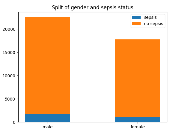
Split of gender by and sepsis status
The majority of distinct patients in our dataset are male. Of note is that the proportion of patients with sepsis is slightly higher in our female population. However, this is not enough information to draw any conclusions from yet.


As mentioned earlier, this dataset includes many different hourly recordings of patients. The column denoting sepsis in our dataset, sepsislabel can have a value of 0 or 1. This means that patients may either not present with sepsis during their in-patient stay, have sepsis at preadmission or meet criteria for sepsis post-admission. The following queries investigate the split of these presentations and provide the basis for further statistical analysis of any longitudinal populations.


Investigating those who arrived to ICU with sepsis vs those meeting criteria during their hospital stay

					
#Extracting split of gender between pre vs post admission in those with sepsis

query = """WITH postadmission_sepsis AS (
	SELECT *,
     	LAG(sepsislabel) OVER (PARTITION BY patient_id ORDER BY iculos) AS prev_sepsislabel
    FROM public.patient_data
)

SELECT
	COUNT(DISTINCT CASE WHEN hour = 0 AND sepsislabel = 1 AND gender = 0 THEN patient_id ELSE NULL END) as female_preadmission_sepsis,
	COUNT(DISTINCT CASE WHEN hour = 0 AND sepsislabel = 1 AND gender = 1 THEN patient_id ELSE NULL END) as male_preadmission_sepsis,
    COUNT(DISTINCT CASE WHEN hour > 0 AND prev_sepsislabel = 0 AND sepsislabel = 1 AND gender = 0 THEN patient_id ELSE NULL END) as female_postadmission_sepsis,
	COUNT(DISTINCT CASE WHEN hour > 0 AND prev_sepsislabel = 0 AND sepsislabel = 1 AND gender = 1 THEN patient_id ELSE NULL END) as male_postadmission_sepsis
FROM postadmission_sepsis"""

csv_file_path = 'sepsis_type_gender.csv'

export_query_to_csv(query, csv_file_path)


# Exploratory look at stacked_bar but issues with labelling
query_visualization_stacked_bar(
'sepsis_type_gender.csv', 'sepsis type', 'Count of patients', 
'Split of sepsis admission by gender')


#Visualisation:  Using matplotlib and manually inputted array for cleaner vis
gender = (
    "male",
    "female"
)
sepsis_type = {
    "preadmission": np.array([251, 175]),
    "post-admission": np.array([1488, 1018]),
}
width = 0.5

fig, ax = plt.subplots()
bottom = np.zeros(2)

for boolean, sepsis_type in sepsis_type.items():
    p = ax.bar(gender, sepsis_type, width, label=boolean, bottom=bottom)
    bottom += sepsis_type

ax.set_title("Split of gender and sepsis admission")
ax.legend(loc="upper right")

plt.show()


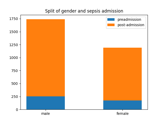
split of gender and sepsis admission

This breakdown of sepsis distribution by gender and admission type highlights the difference in count of sepsis between gender more clearly.

It also demonstrates that post-admission diagnosis of sepsis makes up the majority of the total population of patients with sepsis. Another thing of note is that our female population has a disproportionately higher count of preadmission patients than their male counterpart.


For this analysis to have any predictive power, it's important that we take our newly classified sepsis types and understand the advantages of having a population of distinct patients who arrived without sepsis but eventually deteriorated into a sepsis status.

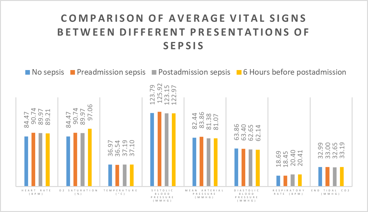
To examine predictors that might lead to sepsis, the population of post-admission patients had their health measures captured at two snapshots in time: at time of sepsis confirmation, and six hours before. To do this we would need to utilise some larger more involved queries. The query below extracts four unique measures for each health feature, including our longitudinal comparison.

					
# View source code for full query					
# Extracting avg vital signs for Non-sepsis, preadmission sepsis, postadmission sepsis and 6 hours prior to postadmission

query = ("""WITH cte AS (
    SELECT *,
           LAG(sepsislabel) OVER (PARTITION BY patient_id ORDER BY iculos) AS prev_sepsislabel,
	       LAG(hr, 6) OVER (PARTITION BY patient_id ORDER BY iculos) as six_r_before_sepsishr,
		   
			# ...			
    FROM public.patient_data
)

SELECT
	avg(CASE WHEN sepsislabel = 0 THEN hr ELSE NULL END) AS avg_hr_no_sepsis,
	avg(CASE WHEN sepsislabel = 1 AND hour = 0 THEN hr ELSE NULL END) AS avg_hr_preadmission_sepsis,
	avg(CASE WHEN sepsislabel = 1 AND hour > 0 AND prev_sepsislabel = 0 THEN hr ELSE NULL END) AS avg_hr_postadmission_hour0_sepsis,
	avg(CASE WHEN sepsislabel = 1 AND hour > 0 AND prev_sepsislabel = 0  AND six_r_before_sepsishr IS NOT NULL THEN six_r_before_sepsishr ELSE NULL END) as avg_hr_six_hour_before_admission,
	
	# ...					

FROM cte""")


csv_file_path = 'avg_distribution_by_sepsis.csv'
export_query_to_csv(query, csv_file_path)


# Visualisation: Using bar graph function to get initial visual
filename = 'avg_distribution_by_sepsis.csv'
xl = 'Features'
yl = 'Average Values'
title = 'Average Values Grouped by Features'
query_visualization_bar(filename, xl, yl, title)


The initial visualisation provided by our bar graph function technically displayed the new filtered data, but was far too much of an eyesore to present as a finished product. Manually inputting our new array of data would provide a better launch pad to create a usable visualisation. Like the rest of this projects code, the new visualisation can be viewed via the button, "View Source Code" at the top of this section.

Comparison of Average Vital Signs Between Different Presentations of Sepsis


Distribution Analysis

This section explores the transformations we made to the dataset in order to examine distributions through histograms. The goal was to prepare two separate csv's through a specialised SQL query. One table to examine our independent groups, sepsis vs no sepsis, and the other to examine our longitudinal group who acquired sepsis as in-patients.


The first query pulls the averages of each health measure and groups them by both patient_id and sepsislabel.


# Extracting avg vital and laboratory values for each patient based on sepsislabel
query = ("""SELECT
	patient_id,
	sepsislabel,
	AVG(HR) AS avg_HR,
	AVG(O2Sat) AS avg_O2Sat,
	AVG(Temp) AS avg_Temp,
	AVG(SBP) AS avg_SBP,
	AVG(MAP) AS avg_MAP,
	AVG(DBP) AS avg_DBP,
	AVG(Resp) AS avg_Resp,
	AVG(EtCO2) AS avg_EtCO2,
	AVG(BaseExcess) AS avg_BaseExcess,
	AVG(HCO3) AS avg_HCO3,
	AVG(FiO2) AS avg_FiO2,
	AVG(pH) AS avg_pH,
	AVG(PaCO2) AS avg_PaCO2,
	AVG(SaO2) AS avg_SaO2,
	AVG(AST) AS avg_AST,
	AVG(BUN) AS avg_BUN,
	AVG(Alkalinephos) AS avg_Alkalinephos,
	AVG(Calcium) AS avg_Calcium,
	AVG(Chloride) AS avg_Chloride,
	AVG(Creatinine) AS avg_Creatinine,
	AVG(Bilirubin_direct) AS avg_Bilirubin_direct,
	AVG(Glucose) AS avg_Glucose,
	AVG(Lactate) AS avg_Lactate,
	AVG(Magnesium) AS avg_Magnesium,
	AVG(Phosphate) AS avg_Phosphate,
	AVG(Potassium) AS avg_Potassium,
	AVG(Bilirubin_total) AS avg_Bilirubin_total,
	AVG(TroponinI) AS avg_TroponinI,
	AVG(Hct) AS avg_Hct,
	AVG(Hgb) AS avg_Hgb,
	AVG(PTT) AS avg_PTT,
	AVG(WBC) AS avg_WBC,
	AVG(Fibrinogen) AS avg_Fibrinogen,
	AVG(Platelets) AS avg_Platelets,
	AVG(Age) AS avg_Age,
	AVG(Gender) AS avg_Gender,
	AVG(ICULOS) AS avg_ICULOS

FROM public.patient_data
GROUP BY patient_id, sepsislabel""")

csv_file_path = 'avg_numeric_grouped_by_id+sepsislabel.csv'

export_query_to_csv(query, csv_file_path)		


In order to achieve the same comparison with our laboratory health measures we would need to run a more complex query. For ease of viewing i have trimmed repetitive lines.


# Extracting laboratory and categorical values from patients with sepsis at time of postadmission and 6 hours before, filtering out null values.
query = ("""WITH cte AS (
    SELECT *,
           LAG(sepsislabel) OVER (PARTITION BY patient_id ORDER BY iculos) AS prev_sepsislabel,
	       LAG(BaseExcess, 6) OVER (PARTITION BY patient_id ORDER BY iculos) as six_r_before_sepsis_BaseExcess,

		   ...

    FROM public.patient_data
)

SELECT
    BaseExcess_postadmission_hour0_sepsis,
    BaseExcess_six_hour_before_admission,
    
	...

FROM (
    SELECT
        (CASE WHEN sepsislabel = 1 AND hour > 0 AND prev_sepsislabel = 0 THEN BaseExcess ELSE NULL END) AS BaseExcess_postadmission_hour0_sepsis,
        (CASE WHEN sepsislabel = 1 AND hour > 0 AND prev_sepsislabel = 0 AND six_r_before_sepsis_BaseExcess IS NOT NULL THEN six_r_before_sepsis_BaseExcess ELSE NULL END) AS BaseExcess_six_hour_before_admission,

		...
      
    FROM cte
) AS filtered_data
WHERE 
    BaseExcess_postadmission_hour0_sepsis IS NOT NULL AND BaseExcess_six_hour_before_admission IS NOT NULL
	...
    
""")

csv_file_path = 'temporal_non_vitals.csv'

export_query_to_csv(query, csv_file_path)


With the newly saved query results, we are able to start plotting our data against each other in histograms to look at their distributions. Due to the amount of histograms we are looking at, it makes more sense to create a function for more efficient use of our time.

	
# Histogram function for looking at avg vital signs and laboratory features for sepsis vs no-sepsis
def histogram_visualisation_one_feature(column):
    df = pd.read_csv('avg_numeric_grouped_by_id+sepsislabel.csv')

    # Filter and plot data using Seaborn/Matplotlib
    sepsis_0_data = df[df['sepsislabel'] == 0]
    sepsis_1_data = df[df['sepsislabel'] == 1]

    plt.figure(figsize=(8, 6))

    # Using seaborn for cleaner visual + KDE.
    sns.histplot(sepsis_0_data[column], bins=20, kde=True, color='blue', label='No Sepsis', stat='percent')
    sns.histplot(sepsis_1_data[column], bins=20, kde=True, color='orange', label='Sepsis', stat='percent')
    plt.xlabel(column)
    plt.ylabel('Percent')  # Percent used due to better visualise due to disparity in group sizes
    plt.title(f'Histogram for {column}')
    plt.legend()
    plt.show()


# Histogram function with vital or non-vital csv entered. Longitudinal histogram.
def histogram_visualisation_temporal(csv_file, column):
    df = pd.read_csv(csv_file)

    # Filter via dataframe and plot data using Seaborn/Matplotlib
    six_hr_pre_data = df[f'{column}_six_hour_before_admission']
    post_admission_data = df[f'{column}_postadmission_hour0_sepsis']


    plt.figure(figsize=(10, 8))
    sns.histplot(six_hr_pre_data, bins=20, kde=True, color='blue', label='6 Hours Before Admission')
    sns.histplot(post_admission_data, bins=20, kde=True, color='orange', label='First Hour of PostAdmission')
    plt.xlabel(column)
    plt.ylabel('Frequency')
    plt.title(f'Histogram for {column}')
    plt.legend()
    plt.show()


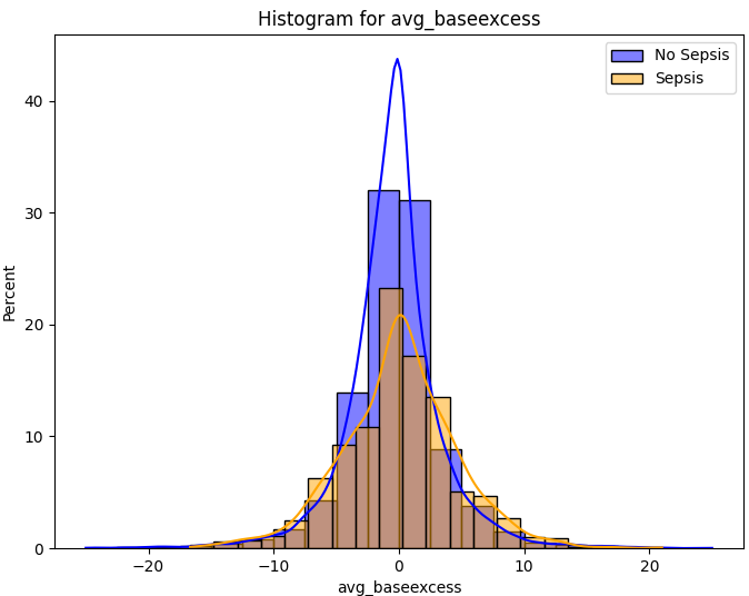
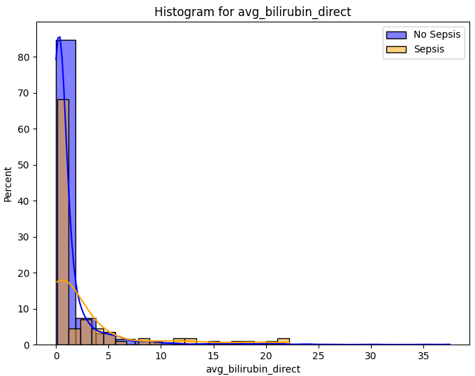
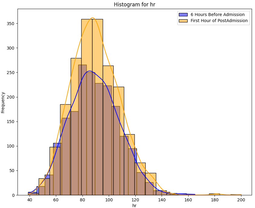
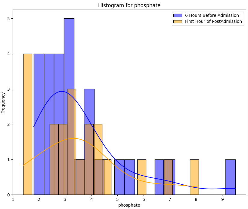
Below are some examples of histograms produced by our functions. From both our sepsis vs no sepsis (independent groups) and our longitudinal sample, you can see somewhat normally distributed samples as well as histograms that were limited due to available data.

avg_baseexcess avg_bilirubin_direct

temporal_hr temporal_phosphate

Visualising our comparisons through histograms is an important step along the way of determining how we can implement further statistical methods for future analysis. To perform statistical comparisons using independent or Paired Samples t-Test, two key assumptions need to be met.

  1. The first assumption is that our data is normally distributed between our groups, which while histograms give a good visual indicator, can be further tested using Shapiro-Wilk testing.
  2. The second assumption is homogeneity of variances between our two groups which can be verified using Levene's test.

Distribution and Variance Testing

Upon carefully observing the histograms and assessing the normality of our data distributions, a decision was made for each health variable regarding the appropriate statistical test to employ. In instances where histograms portray a semblance of normality, the Shapiro-Wilk test was used to verify the assumption. Shapiro-wilk was also used in cases where normal distribution was questionable to rule out Independent and Paired Samples t-Test.


The functions used to calculate normal distribution and homogeneity of variances are displayed below.

				
def shapiro_wilk_test_temporal(csv_file, column):
	df = pd.read_csv(csv_file)

	# Extract the specified columns
	six_hour_before = df[f'{column}_six_hour_before_admission']
	postadmission = df[f'{column}_postadmission_hour0_sepsis']

	# Perform the Shapiro-Wilk test for both groups
	stat1, p_value1 = shapiro(six_hour_before.dropna())
	stat2, p_value2 = shapiro(postadmission.dropna())
	alpha = 0.05

	# Print the results for 6 hours prior to post-admission
	print(f"Shapiro-Wilk Test for {six_hour_before}:")
	print(f"Test Statistic: {stat1}")
	print(f"P-value: {p_value1}")
	if p_value1 > alpha:
		print("The data follows a normal distribution (fail to reject H0)")
	else:
		print("The data does not follow a normal distribution (reject H0)")

	# Print the results for post-admission
	print(f"Shapiro-Wilk Test for {postadmission}:")
	print(f"Test Statistic: {stat2}")
	print(f"P-value: {p_value2}")
	if p_value2 > alpha:
		print("The data follows a normal distribution (fail to reject H0)")
	else:
		print("The data does not follow a normal distribution (reject H0)")


# --------------------------------------------------------------------------------------


def levenes_test_categorical(csv_file, health_parameter, variation):

    df = pd.read_csv(csv_file)

    sepsis_group = df[df['sepsislabel'] == 1][health_parameter]
    no_sepsis_group = df[df['sepsislabel'] == 0][health_parameter]

    Center=variation

    statistic, p_value = levene(sepsis_group.dropna(), no_sepsis_group.dropna(), center=variation)

    alpha = 0.05
    print("p-value:", p_value)
    print("Levene's test statistic", statistic)


After running each variable in both our longitudinal groups and independent groups through our Shapiro-wilk function, we were able to determine if any of our groups met the assumptions needed to perform the relevant t-testing. None of the health measures the sepsis vs no sepsis group met the significance level required to suggest normality of their distribution. Normal distributions seen in the longitudinal groups can be seen in the following table.

Health Measure Test-statistic P-value
baseexcess first hour of sepsis 0.9783 0.3205
baseexcess six hours before admission 0.9775 0.1654
chloride first hour of sepsis 0.9756 0.6129
etco2 first hour of sepsis 0.9903 0.1293
fibrinogen first hour of sepsis 0.8274 0.0558
fibrinogen six hours before admission 0.9083 0.1277
hco3 six hours before admission 0.9713 0.5554
hct six hours before admission 0.9882 0.6671
hgb first hour of sepsis 0.9709 0.3400
hgb six hours before admission 0.9826 0.4501
magnesium six hours before admission 0.9815 0.6923
paco2 first hour of sepsis 0.9840 0.5754
ph first hour of sepsis 0.9740 0.5307
ph six hours before admission 0.9860 0.3688
platelets first hour of sepsis 0.9380 0.1206

Understanding the distributions of our variables in both groups allows us to select the appropriate comparative statistical analysis that can give further insight into significant difference between means.

Comparative Statistical Analysis

  • View Source Code


  • The following section details our statistical analysis of our sepsis vs no sepsis group and our longitudinal population. Despite visual inspection of histograms, results from Shapiro-Wilk indicated that none of the independent group had distributions that were normal. Mann-Whitney U test was selected to compare means across non-normally distributed samples in our sepsis vs no sepsis dataset. Wilcoxon signed-rank test was used for the same purpose in our longitudinal dataset, however due to the fact that some health measures were either partially or totally normally distributed in this dataset, Welch's t-test and Paired-Samples t-test were also implemented.


    Functions used for the Mann-Whitney u test and Paired-Samples t-test have been provided below as examples.

    				
    					# Mann-Whitney U test: Used when groups do not follow a normal distribution
    def mann_whitney_u_test(csv_file, health_parameter):
        # Read the CSV file into a DataFrame
        df = pd.read_csv(csv_file)
    
        # Separate data into sepsis and no-sepsis groups based on 'sepsislabel'
        sepsis_group = df[df['sepsislabel'] == 1][health_parameter]
        no_sepsis_group = df[df['sepsislabel'] == 0][health_parameter]
    
        # Perform Mann-Whitney U test to compare the two groups
        u_statistic, p_value = mannwhitneyu(sepsis_group.dropna(), no_sepsis_group.dropna())
    
        # Set the significance level (alpha) for the test
        alpha = 0.05
    
        # Print test results
        print("p-value:", p_value)
        print("u-statistic:", u_statistic)
    
        # Check if the p-value is less than the significance level
        if p_value < alpha:
            print(f'Reject the null hypothesis: There is a significant difference in {health_parameter} between sepsis and no sepsis groups.')
        else:
            print(f'Fail to reject the null hypothesis: There is no significant difference in {health_parameter} between sepsis and no sepsis groups.')


    # ------------------------------------------------------------------


    # Paired T-Test used for longitudinal difference in data that follows normal distribution
    def paired_samples_ttest(csv_file, column):
        df = pd.read_csv(csv_file)
    
        six_hour_before = df[f'{column}_six_hour_before_admission']
        postadmission = df[f'{column}_postadmission_hour0_sepsis']
    
        # Drop rows with missing values for both arrays
        paired_data = pd.concat([six_hour_before, postadmission], axis=1,
                                keys=['six_hour_before', 'postadmission']).dropna()
    
        t_statistic, p_value = ttest_rel(paired_data['six_hour_before'], paired_data['postadmission'])
    
        alpha = 0.05
        print("p-value:", p_value)
        print("t-statistic:", t_statistic)
    
        if p_value < alpha:
            print(
                f'Reject the null hypothesis: There is a significant difference in {column} between post-admission and six hours before post-admission.'
            )
        else:
            print(
                f'Fail to reject the null hypothesis: There is no significant difference in {column} between post-admission and six hours before post-admission.')


Sepsis vs No Sepsis Results

The significant results (p < 0.05) from our Mann-Whitney U test on Sepsis vs Non-sepsis have been printed below.

Health Measure U-Statistic P-value
avg_hr 2.0688721863820536e-112 72691835.0
avg_temp 1.115159734413321e-120 70814452.5
avg_sbp 1.2188321573121263e-11 50328445.5
avg_map 1.4931092738935008e-24 51355452.0
avg_dbp 7.861981293676049e-17 33892050.5
avg_resp 5.073121984639124e-87 69790711.5
avg_etco2 0.04520731605293466 610644.5
avg_baseexcess 4.089178829506648e-07 8133221.5
avg_hco3 0.0011589193689728026 10880071.0
avg_ph 2.280822622913442e-10 16912353.5
avg_ast 4.2297517776857715e-22 6203402.0
avg_bun 1.8675373522874048e-91 45793038.5
avg_alkalinephos 1.1746990591248042e-08 5641459.0
avg_calcium 5.298465013980368e-29 26694468.0
avg_creatinine 1.627413610789237e-32 6367386.5
avg_bilirubin_direct 0.00014050591896512378 1059368.0
avg_glucose 3.2702182993485417e-40 30034013.0
avg_hct 1.1764822433372962e-37 27901852.0
avg_hgb 7.415451791957762e-16 11148513.0
avg_ptt 1.0856523875095939e-34 37910995.5
avg_wbc 7.812471258281706e-18 28614703.5
avg_fibrinogen 1.7032294338590174e-06 33127652.5
avg_magnesium 1.7032294338590174e-06 33127652.5
avg_phosphate 1.7032294338590174e-06 33127652.5
avg_bilirubin_total 1.7032294338590174e-06 33127652.5

Understanding the significance of these findings relies on understanding the physiological processes involved in sepsis. The above table shows that of the 32 health measures analysed, only 5 were indicated to be similar between groups: oxygen saturation, FiO2, PaCO2, SaO2 and age. This is hard to interpret without further knowledge on what concrete information on what patients respiratory status was or what ventilation assistance they recieved if any.

The remaining health measures are likely different because they all relate to the systemic changes that occur during sepsis and its inflammatory processes. Body temperature, heart rate, respiratory rate are fundamental known associated measures with Systemic inflammatory Response Syndrome (SIRS), so we would expect a significant difference between people with sepsis and without.

Similarly, the laboratory measures included all provide information on metabolic changes in the body in response to sepsis. Metabolic acidosis can be identified through detecting changes in base excess, bicarbonate(HCO3) and of course pH. Increased coagulation and inflammatory response can be identified in the counts of fibrinogen, hct, hgb, ptt and of couse white blood cell counts. Finally, organ dysfunction is seen in liver and kidney measures such as bilirubin, blood urea nitrogen, and aspartate(ast).

We would expect to see a significant difference in these means between our sepsis and no sepsis groups as they are all clinically correlated with sepsis.


Investigating results of longitudinal population analysis

Wilcoxon's Signed-Rank Tests

Test Test Statistic p-value
hr 723187.0 0.001573533882982657
o2 440346.0 0.00215827237665219
temp 14107.5 3.148096430712528e-06
sbp 657974.0 0.004879649337608732
fio2 126.5 0.00020836917613258513
sao2 64.0 0.042230123328286504


Welch's t-test

Test Test Statistic p-value
hco3 -2.083109043725959 0.04174842570553332


Paired Samples t-test

Test Test Statistic p-value
baseexcess -2.7101206347969833 0.009484196472189704
ph -2.442012352706532 0.017569771338410884

The table above highlights all of the test results that passed our p-value significance threshold of 0.05. These values provide some information for differences between our sepsis population at different times during their in-patient journey.

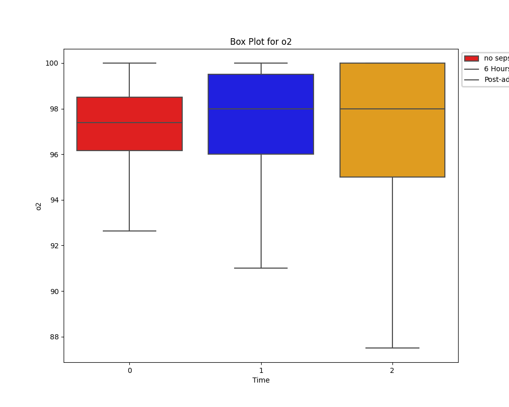
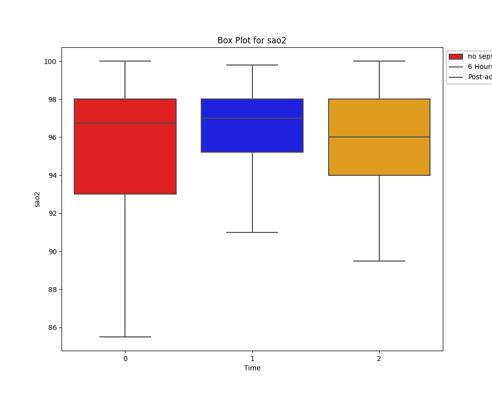
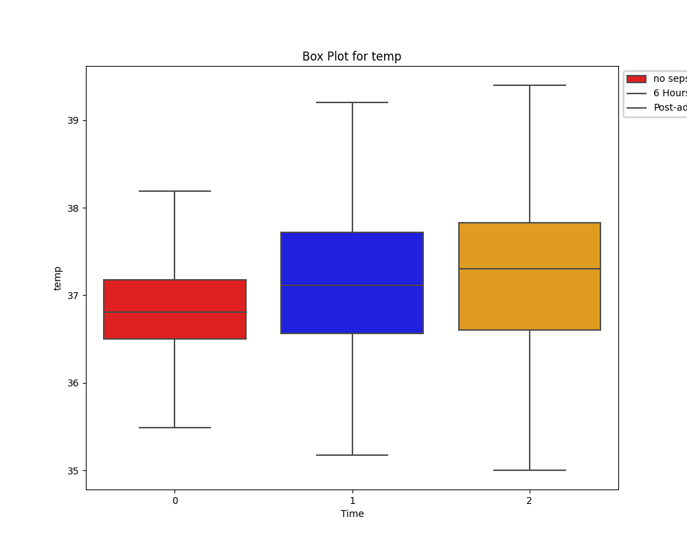
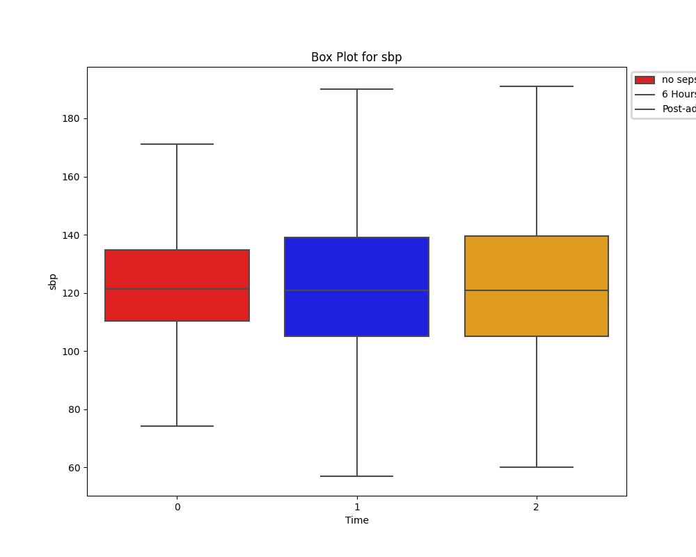
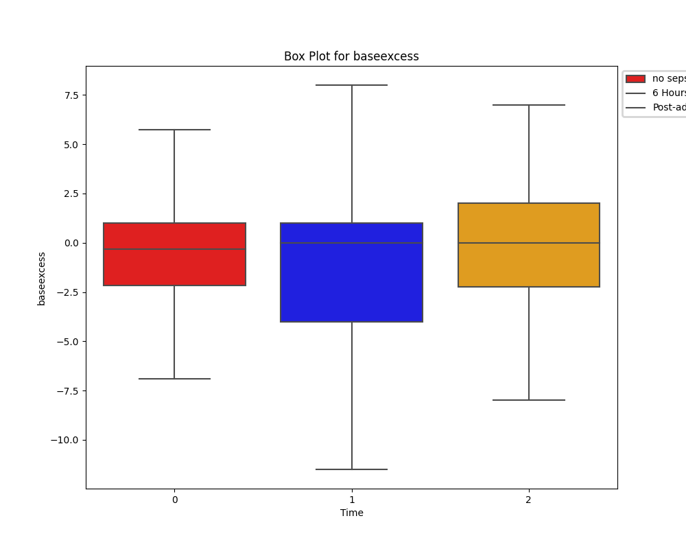
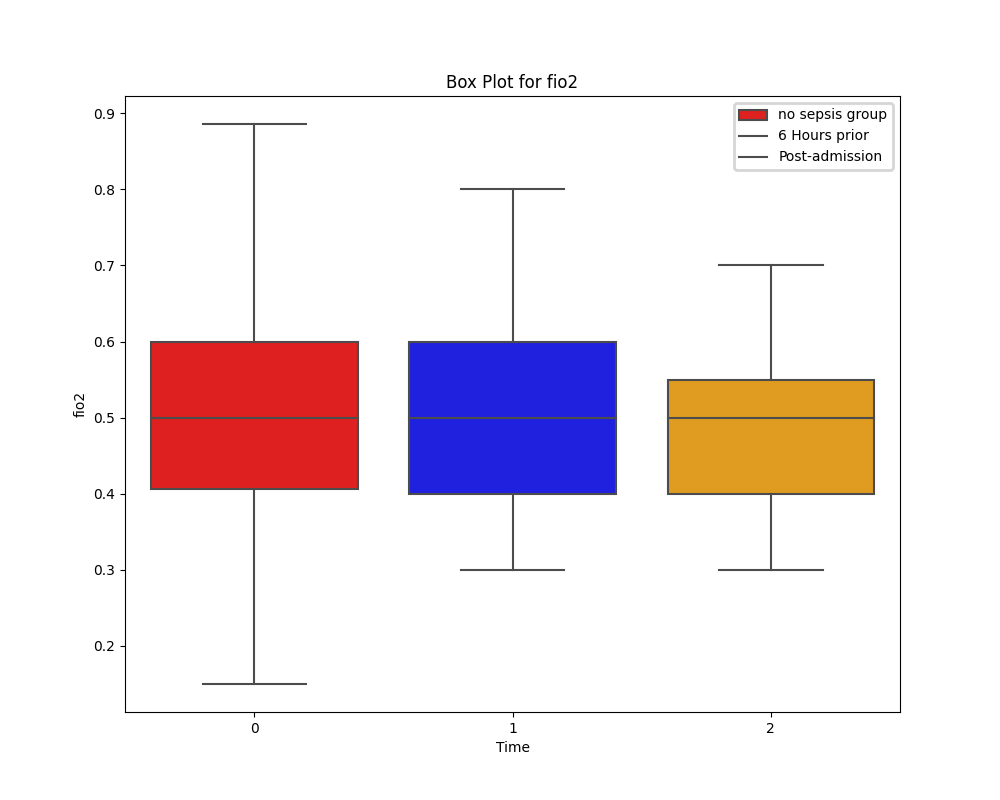
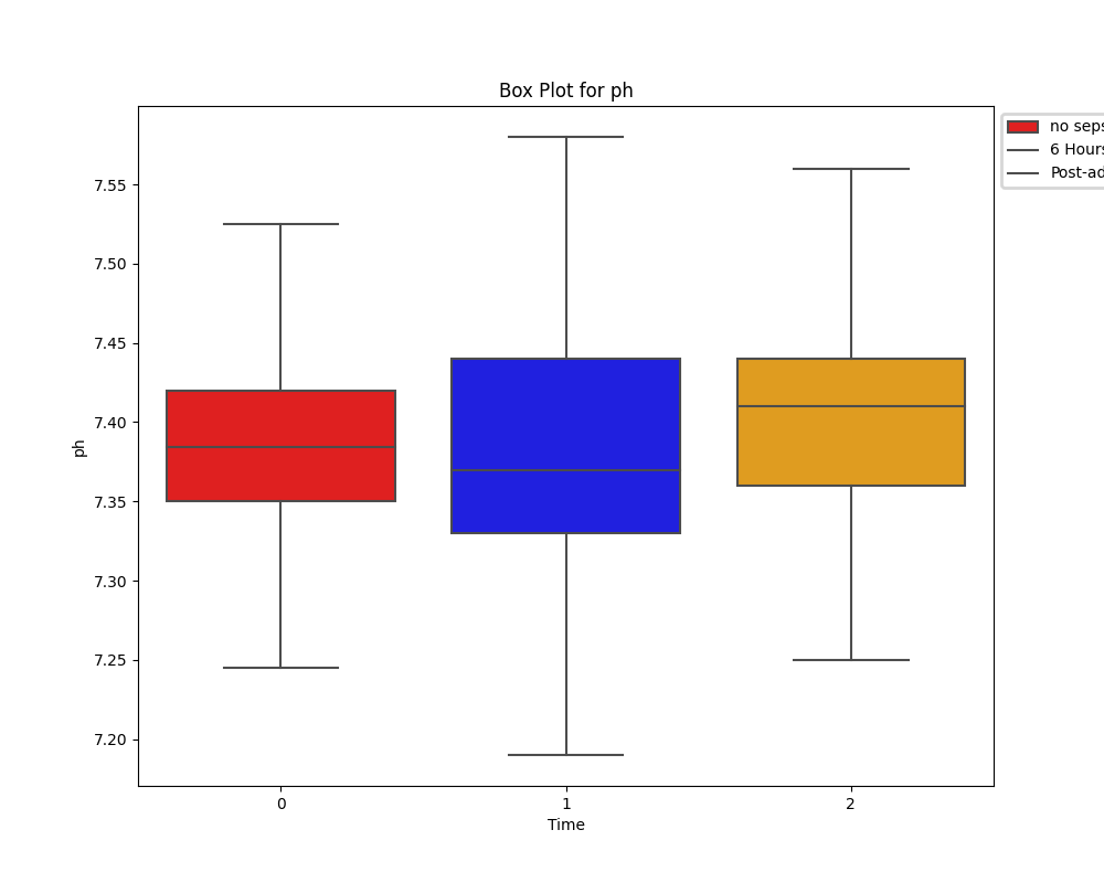
To get a clearer idea of the differences in means of our significant health measures, we can visualise the distribution using boxplots.

Boxplots

  • View Source Code


  • To visualise our distributions of health measures at the time of sepsis and 6 hours before, the following function was created.

    				
    def boxplot_visualisation_temporal(csv_file, column):
    	df = pd.read_csv(csv_file)
    
    	six_hr_pre_data = df[f'{column}_six_hour_before_admission']
    	post_admission_data = df[f'{column}_postadmission_hour0_sepsis']
    
    	plt.figure(figsize=(10, 8))  # Set the figure size before creating the box plot
    	ax = sns.boxplot(data=[six_hr_pre_data, post_admission_data], palette=['blue', 'orange'])
    
    	# Label and legend adjustments (legend not perfect)
    	legend = ax.legend(labels=['6 Hours prior', 'Post-admission'])
    	legend.set_bbox_to_anchor((1, 1))  # Adjust the anchor point as needed
    	legend.get_frame().set_linewidth(2)  # Set the border width of the legend box
    
    	ax.set_xlabel('Time')
    	ax.set_ylabel(f'{column}')
    	plt.title(f'Box Plot for {column}')
    	plt.show()


    Boxplots

    Heart Rate

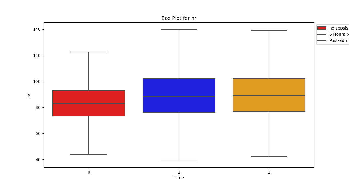
    Despite a significant difference between means being found in our Wilcoxon Signed-Rank test, visually the distribution appears identical when looking at patients HR six hours before confirming sepsis and at time of diagnosis. When compared to our larger population without sepsis, we can see that the distribution of pre-sepsis patients sits at a slightly elevated HR.


    Oxygen Saturation (SpO2 and SaO2)

    Unlike the distribution of HR, oxygen saturation does show a difference between the two groups. However, due to limitations of knowledge on respiratory therapies and any assitive ventialation strategies in place for these patients, its impossible to draw conclusions.
    Temperature


    On average, there is an increasing trend in temperature between patients without sepsis, patients who are pre-sepsis and their following recordings post confirmation of sepsis.


    Systolic Blood Pressure


    Base Excess


    Fraction of Inspired Oxygen


    pH


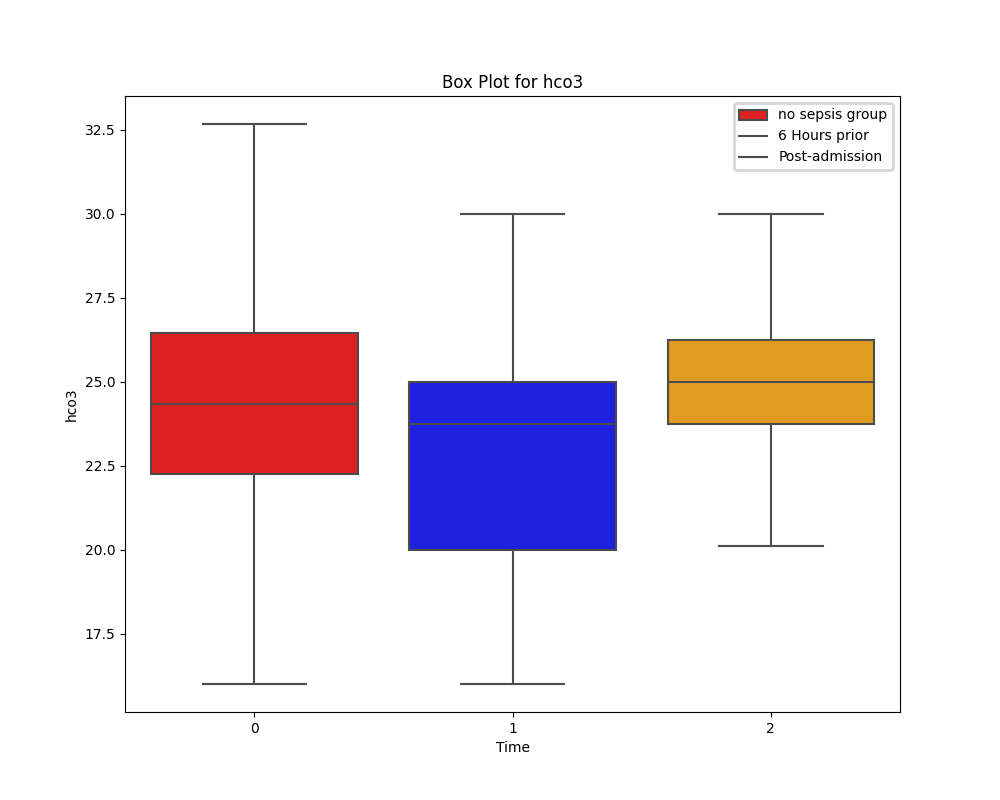
Bicarbonate

Correlation

After observing a statistical difference both in our t-test and histograms/boxplots, its still difficult to get a clear picture of how these health measures interact and which, if any, can help predict sepsis before its onset.

To assist with identifying any trends, appropriate correlation coefficients function based on distribution of data were created.

		
# defaulted to temporal csv due to only normal data between those variables
def pearsons_coefficient(csv_file, column):
	df = pd.read_csv(csv_file)

	six_hour_before = df[f'{column}_six_hour_before_admission']
	postadmission = df[f'{column}_postadmission_hour0_sepsis']

	paired_data = pd.concat([six_hour_before, postadmission], axis=1,
				keys=['six_hour_before', 'postadmission']).dropna()

	correlation_coefficient, p_value = pearsonr(paired_data['six_hour_before'], paired_data['postadmission'])

	print(f"Pearson's Correlation Coefficient: {correlation_coefficient}")
	print(f"P-value: {p_value}")


Spearman's Correlation Coefficient

Parameter Correlation Coefficient P-value Interpretation
hr 0.780 0.000 strong positive. Elevated HR associated with impending sepsis
o2 0.547 1.418e-144 moderate postitive. Limitations within clinical practice
temp 0.667 7.240e-42 strong positive. Increasing temperature associated with sepsis.
sbp 0.648 4.515e-206 strong positive. Changes in SBP consistent with changes at the time of sepsis confirmation
fio2 0.672 1.367e-12 strong positive.
sao2 0.542 0.007 moderate positive.


Pearson's Correlation Coefficient

Parameter Correlation Coefficient P-value Interpretation
baseexcess 0.810 9.584e-12 strong positive.
ph 0.429 0.001 moderate positive.


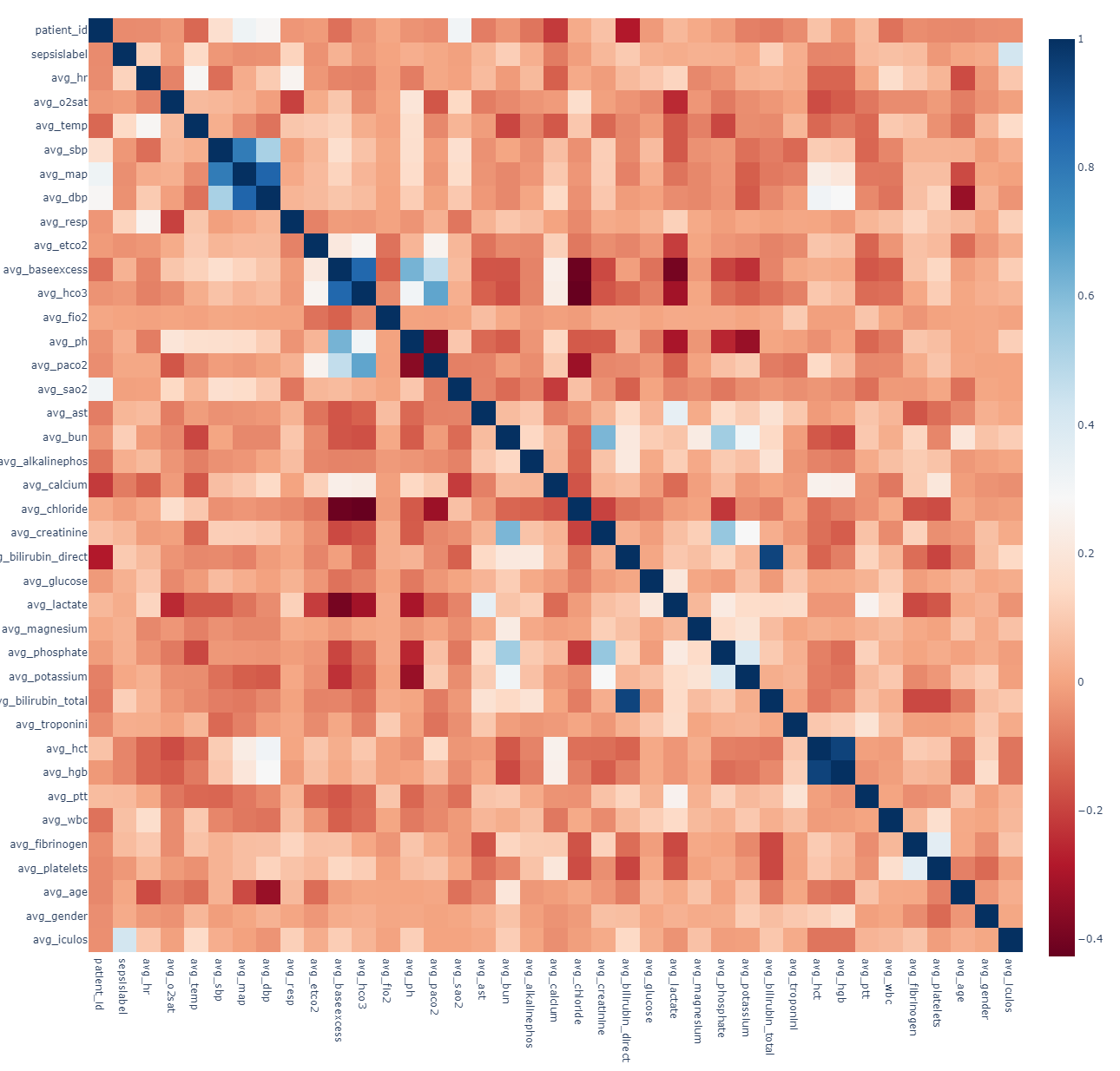
Correlation Matrix: Sepsis vs Non-sepsis


Findings

Known corellative health measures like increasing heart-rate, systolic blood pressure, respiratory rate, and body temperature are also seen in this datasets correlation analysis. Some novel findings are the increasing metabolic-acidosis as seen in base excess and pH levels. There is also some correlation between oxygenation of blood and progressing sepsis but without knowledge of patients individual respiratory treatments, may be confounded as a result.

Conclusion

Through analysis of distributions, statistical methods and correlations, this project aimed to highlight any health measures that could be used to predict the onset of sepsis in patients specifically six hours before hand, acknowledging the limitations of using a dataset designed for machine-learning.


The results of this analysis indicated that increasing heart-rate, systolic blood pressure, body temperature were all vital signs associated with an increased probability of sepsis. This is unsurprising as these metrics are commonly used to confirm the presence of sepsis anyway. This analysis also found that metabolic-acidosis could act as a warning sign for sepsis through measuring base excess and pH levels.


In practice, the insights gained from this statistical analysis could have implications for predicting and managing sepsis, allowing healthcare providers to identify early warning signs and potentially intervene more effectively to improve patient outcomes. It's important to note that further analysis, clinical context, and additional data would be needed to draw definitive conclusions and apply these insights in a medical setting.

// Initialize Prism Prism.highlightAll();